> SAMPLE WORK
Reference Games
These are the games I am using as a benchmark throughout this audit. The goal is not to copy them but to understand what Steam already associates with your genre and what players in that space expect to see.
- Big Ambitions — Very close to your game except the art style.
- Schedule I — The sub-genre is different (crime) but the fantasy is the same. You scale from zero to hero.
Capsule Image
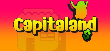
Think of your capsule image the same way you think of a YouTube thumbnail. When someone is browsing Steam they are scrolling past hundreds of games and your capsule has maybe a second to stop them. It is competing with everything else on the page at the same time. If it does not catch attention fast, look high quality, and give some sense of what kind of game this is, people will scroll right past it and never even reach your page.
My take — The capsule does not communicate the game clearly enough at first glance. Now that I spent some time with it I understand what you were going for, but an average Steam user scrolling past it will not stop to figure it out. It needs to do that job instantly.
Suggestions — Hire an artist who specializes in capsule art. Look at Big Ambitions as a reference, you can immediately tell what the game is about just from the capsule. The businessman on the right, the city in the background suggesting you can own it, the dollar sign in the title. Everything works together to signal what the game is about instantly. That is exactly what your capsule should be doing.
Short Description
The short description should tell people what they do in the game, what kind of game it is, and what makes it worth their time. The screenshots and trailer already handle mood and atmosphere, so this is not the place for that.
My take — You do mention what you can do in the game, which is fine, but on their own these things do not sound interesting. The description is missing the fantasy, it lists features without making them feel exciting.
Suggestions — Look at how Big Ambitions and Schedule I frame their descriptions. You could do something like: "Start with nothing and build a Bean Empire. Open businesses, hire workers, climb the ladder and spend your hard-earned cash on cars, apartments, a casino and a life of luxury, all while becoming the most powerful Bean in town." What this does differently is it sells the fantasy immediately. Earn money, climb the ladder, spend it on cool stuff. That is the hook.
Tags
Tags are probably the most technical part of this audit and the one most devs get wrong. They are not just labels that describe your game, they are how Steam decides who to show your page to. Get them wrong and Steam starts putting your game in front of the wrong audience. Wrong audience means weak engagement, and weak engagement means Steam stops recommending it. Everything else on the page can be perfect and wrong tags will still lower your visibility significantly.
My take — Your tags are not set up correctly. Right now if you check the "More Like This" section on your Steam page, your game is being shown next to mostly cute, chill games. The first game in that section that actually resembles yours is MegaQuarium, which is fifth in the list. Everything before it is the wrong audience.
Suggestions — Find 3-4 games that are genuinely similar to yours, identify the tags they share, and use those for your game. Keep in mind that it can take up to two weeks to see a change in traffic after updating your tags.
Screenshots
Most people skip the trailer and just click through the screenshots. A potential buyer should be able to get a clear sense of the gameplay loop, the perspective, and the core experience just from the first four screenshots without reading a single word. If that is not the case, the page is already losing people.
My take — The screenshots are all over the place. There is no clear order or logic to them and they do not cover the core things a player will actually do in the game.
Suggestions — First, remove the dark screenshots. The first one with the arcade machine repair text is very hard to see, and the same goes for the power plant one. Each screenshot should show a distinct mechanic or gameplay loop. For example: screenshot one shows buying or starting a business, screenshot two shows upgrading a business with money increasing, screenshot three shows spending money on an apartment, a car, or the casino, and screenshot four shows some of the lighter side of the game like fishing or helping neighbors. That way you are covering the full experience in four screenshots. I have not played the game myself so treat these as a starting point rather than a strict prescription, you know your game better than I do.
Trailer
Most people do not watch a Steam trailer start to finish. They skip through it. So the trailer needs to show what makes the game exciting and the gameplay immediately, ideally both at the same time. Steam trailers are muted by default, so it should never rely on sound to explain what the game is.
My take — The trailer wastes the first 18 seconds before showing anything resembling gameplay. What you do from second 28 onwards, showing the incremental business upgrades, is the right idea, but it still feels slow and a bit clunky.
Suggestions — Watch the Schedule I trailer. It jumps into the action immediately, the cuts are quick, and you understand the point of the game within the first few seconds. That is the energy your trailer needs. If you have the budget I would suggest hiring someone for this as well.
About This Game
By the time someone reaches this section they have already seen the capsule, screenshots, trailer, and short description. If this is just a wall of text, most people are not reading it. It needs to be easy to skim and it should support everything the rest of the page already set up, not repeat it.
My take — It is very short, there is a lot of repetition, grammar errors, and there is only one gif. It does not do enough to reinforce the game.
Suggestions — At the top, paste your short description word for word. This sounds odd but when your game is shared via a link, the first few sentences of the About This Game section are what gets shown, so you want your best description there. After that, add a gif for each core gameplay loop, four is enough. Keep the text minimal and just use it to describe what is happening in each gif. This section is honestly the least important part of the page, but having solid gifs that reinforce everything the player already saw just seals the deal.
Making Your Game More Marketable
When describing your game always lead with the business and tycoon angle and treat the cute art as a secondary point. If you lead with the Beans and the cartoony visuals you attract players who are into that aesthetic but are not necessarily interested in management games. If you lead with the tycoon fantasy you attract players who are already into that genre, and the art style becomes a nice surprise rather than a filter.
In the trailer, make sure you show the full range of what the player can do — the fishing pond, casino, parkour spots, customizable cars, collectibles. It is important to show not just that you can earn money but that you can spend it on fun stuff. This is actually a gap that similar games like Big Ambitions have, and most of their negative reviews are about it.
The art style feels inconsistent in places. Look at Foundation as an example of a game in a similar genre that pulls off a clean, unified cartoony look. Capitaland would benefit from tightening that up.
The Bean models are, for lack of a better word, unattractive. Take Fall Guys as an example — it goes for a similar style but the characters are actually appealing and fun to look at. It is worth spending some time improving their look.
Fix the grammar throughout the page. If a player notices careless writing they will assume the same lack of attention went into the game itself. It sounds like a small thing but it matters a lot.
Final Verdict
The game itself seems genuinely good — the few reviews you have paint a picture of something fun and worth playing. The problem is the presentation is working against you. The messaging is off, the page is reaching the wrong audience, and you have already launched which means you missed the initial traffic spike that comes with a new release. That said this is still salvageable.
The priority right now is to tighten up the messaging, fix the gameplay loop presentation across the page, and get the tags right. Once all of that is in order you can start thinking about advertising, but that is a separate conversation.